Dashboards & Widgets
Build custom analytics dashboards with drag-and-drop widgets.
Dashboards let you build custom analytics views by combining widgets into a drag-and-drop grid layout. Each widget queries your interaction data and renders it as a chart, stat, or table.
Dashboard list
The Dashboards page shows all your dashboards as cards. Each card shows the title, description, and action buttons.
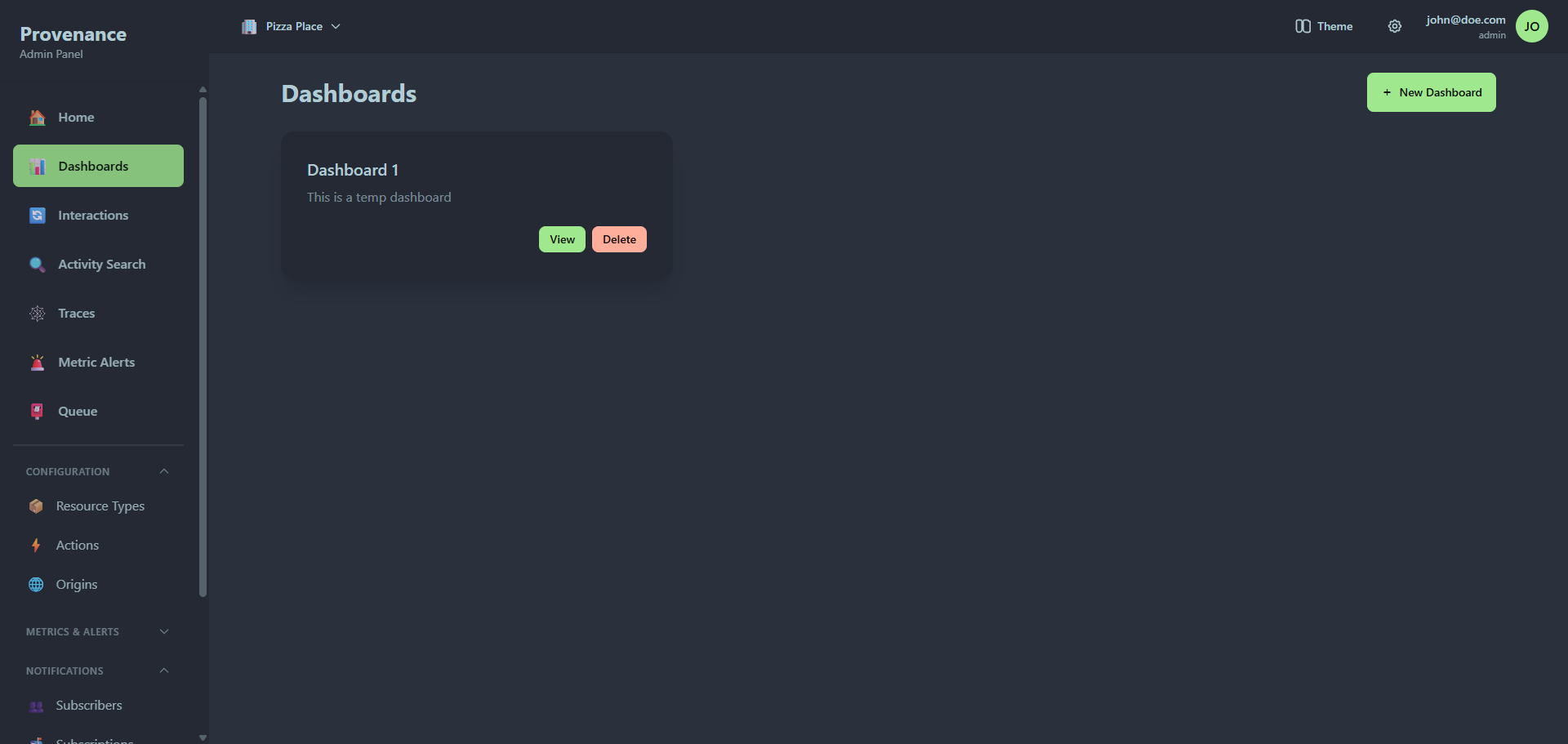
- Click New Dashboard to create one (enter a title and optional description).
- Click View to open a dashboard.
- Click Delete to remove a dashboard and all its widgets.
Dashboard view
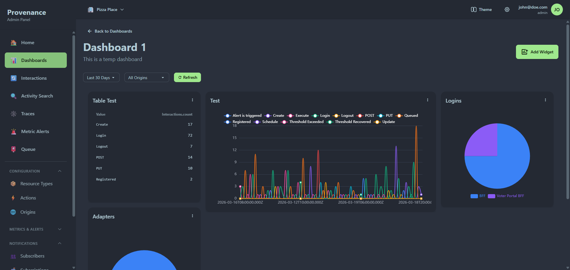
Grid layout
Widgets are arranged in a responsive grid. You can:
- Drag widgets to reposition them.
- Resize widgets by dragging their corners.
- Layout changes are saved automatically.
Global time filter
The time filter bar at the top overrides the time range for all widgets on the dashboard. It also includes an origin filter and a refresh button.
Widget menu
Each widget has a three-dot menu (⋮) with:
- Edit — open the widget builder to modify the widget
- Delete — remove the widget from the dashboard
Widget builder
Click Add Widget to open the widget builder. It uses a split layout: live preview on the left, configuration on the right.
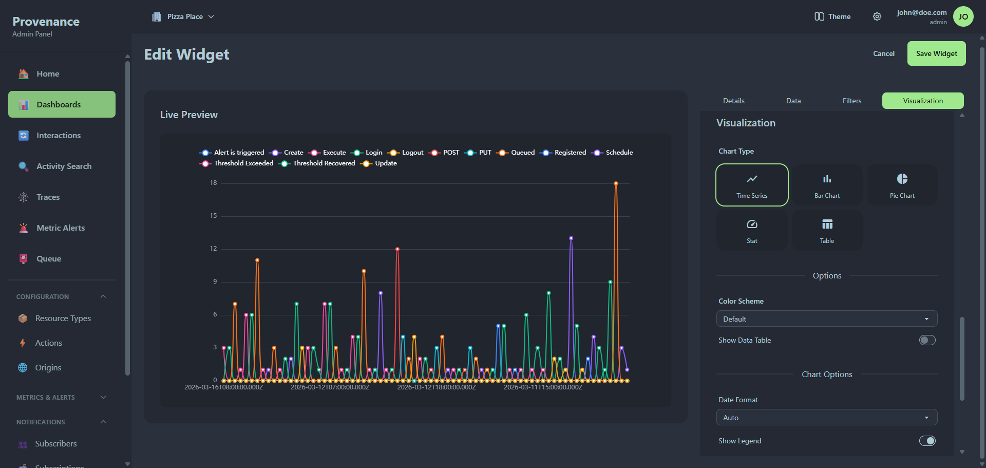
Configuration sections
The right panel has four tabbed sections:
1. Details
- Title — the widget name displayed on the dashboard.
- Context filters — optional quick filters for resource type, action, and origin. These scope the widget's data without needing manual filter conditions.
2. Data
- Time Range — Today, Yesterday, Last 7 days, Last 30 days, Last week, Last month.
- Metrics — what to measure. Built-in options:
- Count of Interactions
- Unique Resources
- Unique Users
- Custom Field (enter any field from your interaction JSON)
- Aggregation — Count, Sum, Average, Minimum, Maximum.
- You can add multiple metrics per widget.
3. Filters & Grouping
- Additional Filters — field/operator/value conditions. Operators: Equals, Not Equals, Contains, Greater Than, Less Than. The field input has autocomplete based on your actual interaction data.
- Group By — check any combination of:
- Time (with granularity: Hour, Day, Week, Month)
- Action
- Resource Type
- Origin
- Custom Field (enter any field name)
4. Visualization
- Chart Type — select from a visual grid:
| Type | Icon | Description |
|---|---|---|
| Time Series | 📈 | Line chart with time on the x-axis |
| Bar Chart | 📊 | Vertical or horizontal bars |
| Pie Chart | 🥧 | Proportional slices |
| Stat | ⏱️ | Single value or multi-value display |
| Table | 📋 | Raw data in rows and columns |
- Color Scheme — Default, Blue, Green, Purple, Warm, Cool.
- Show Data Table — toggle to show a data table alongside the chart.
- Chart Options — chart-type-specific settings (varies by chart type).
- Color Overrides — map specific values to specific colors (e.g. "Error" → red, "Success" → green).
Live preview
The left panel shows a real-time preview of your widget. It updates automatically as you change settings (with a 1-second debounce). The preview shows the actual data from your tenant.
Stat widget
When grouped by a dimension (e.g. action), the stat widget renders as a multi-stat grid — circular indicators for each value with the count inside.
Table widget
The table visualization shows sortable columns with the raw data. For time series data, the first column is the timestamp. For categorical data, it's the category name.